Spider-Man: Across the Spider-Verse – A Masterpiece of Comic Book Artistry on the Big Screen
As audiences are captivated by the latest Spider-Man sequel, Kambole Campbell examines how the film’s visuals honor the tradition and evolution of its comic book origins.

As the latest film, Spider-Man: Across the Spider-Verse, captivates audiences, it’s worth reflecting on how this animated superhero series distinguishes itself with innovative visuals that pay homage to the source material. With the introduction of the “multiverse” concept in 2018’s Spider-Man: Into the Spider-Verse, the franchise has broken away from formulaic storytelling and embraced the unique visual language of comic books.
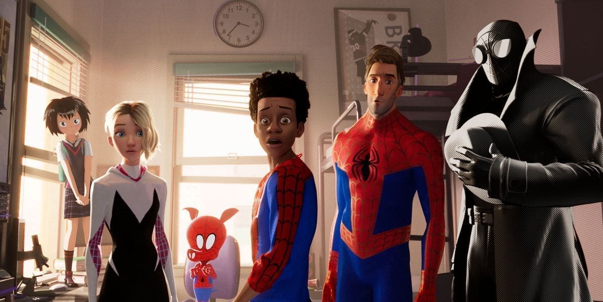
The first film, directed by Peter Ramsay, Rodney Rothman, and Bob Persichetti, combined traditional animation techniques and comic book art to create a distinct style that made the central character, Miles Morales, feel as iconic as his predecessor, Peter Parker. The teams of filmmakers and artists on both Spider-Verse films have worked together to bring the dynamism of comic books to life, using onscreen written sound effects, “burst cards,” and the textures and tactile qualities of print, such as halftone, Ben-Day dots, and “Kirby Krackle.”
Across the Spider-Verse takes this approach even further, with its team of over 1,000 artists and animators experimenting visually and narratively with what a Spider-Man story could be on screen. The film plays with animation frame rates to create the flipping-page effect and introduces the character of Spider-Punk/Hobie Brown, voiced by Daniel Kaluuya, whose different body parts move at varying speeds, evoking the chaotic energy of a stack of pages being thrown at the viewer.
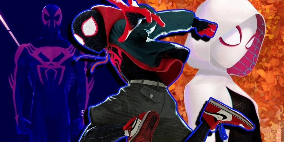
The film also expands its visual palette to reflect the vastness of comic book artistry, incorporating the styles of various artists and decades of comic book evolution. From Gwen Stacy/Spider-Woman’s universe, inspired by Robbi Rodriguez’s expressive brushwork, to the inking techniques of Rick Leonard for Spider-Man 2099, and the nod to Tom Lyle’s original character designs for Ben Reilly, aka Scarlet Spider, Across the Spider-Verse honors the medium’s rich history and its ongoing transformation.
The main villain of the film, The Spot, exemplifies the series’ embrace of artistic imperfections, as he appears like an unfinished drawing with ink splotches. His misshapen appearance is a thematic reflection of the film’s visual non-conformity, embodying Miles Morales’ resistance to fitting within a narrative box prescribed by others.
Unlike many contemporary superhero movies that simply lift storylines from comic books, the Spider-Verse films genuinely honor the spirit of the medium, showcasing the expressive potential of animation. These films remind us that writers are only one part of what makes a comic book, with colorists, pencillers, inkers, letterers, and cover artists also playing integral roles in bringing these characters to life.
With a third and final Spider-Verse film set for release next March, the series has demonstrated the true potential of what a comic book movie can be, inspiring other films like The Mitchells Versus the Machines, Puss in Boots: The Last Wish, and the upcoming Teenage Mutant Ninja Turtles: Mutant Mayhem to explore varied and stylized approaches to animation.
Spider-Man: Across the Spider-Verse is a testament to the power of comic book artistry and a shining example of how animation can elevate storytelling, leaving a lasting impact on both the superhero genre and the world of cinema.
Spider-Man: Across the Spider-Verse is now playing in theaters worldwide.


